If you’ve arrived via Instagram or Facebook – welcome to the blog. It’s a corner this painter and decorator is residing in while her broken ankle heals. Being cooped-up is stifling, so this is an outlet for my creativity and you are welcome to sit down and join me.
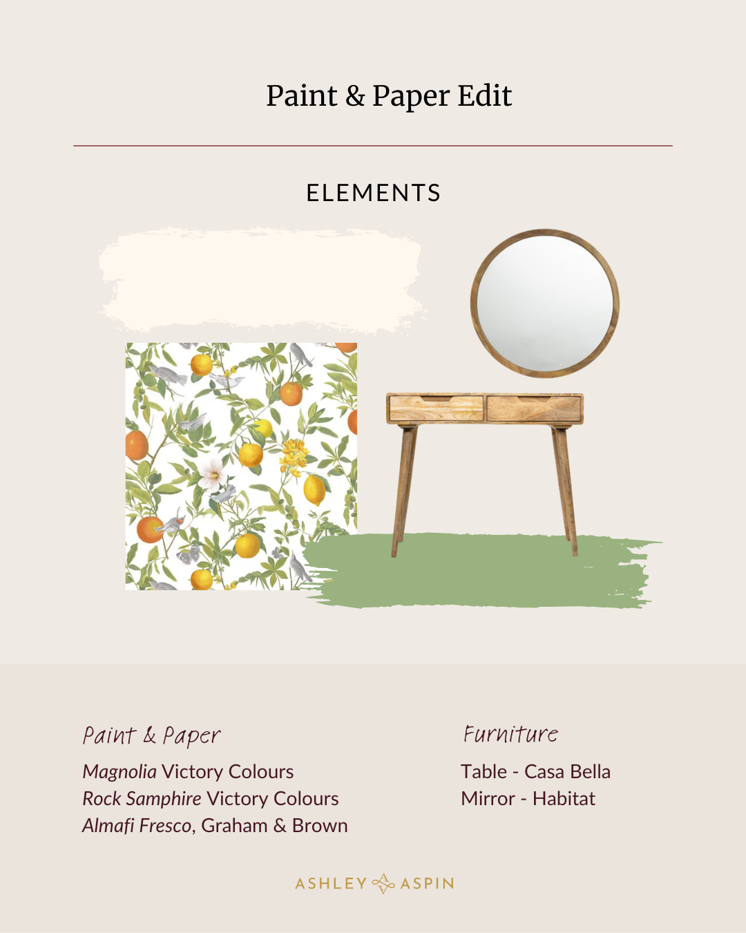
On the Edit today is a wallpaper Amalfi by Graham & Brown, paired with paints by Victory Colours (I highly recommend their premium quality, eco-friendly coatings.) Graham & Brown are one of my favourite suppliers of wallpaper, thanks to their exceptional designers, and the paper quality is top notch. There’s something about this design that transports me to sun drenched citrus groves and effortless charm of the mediterranean. It reminds me of a favourite scent too – Jo Malone’s Orange Blossom – all clementines and neroli.
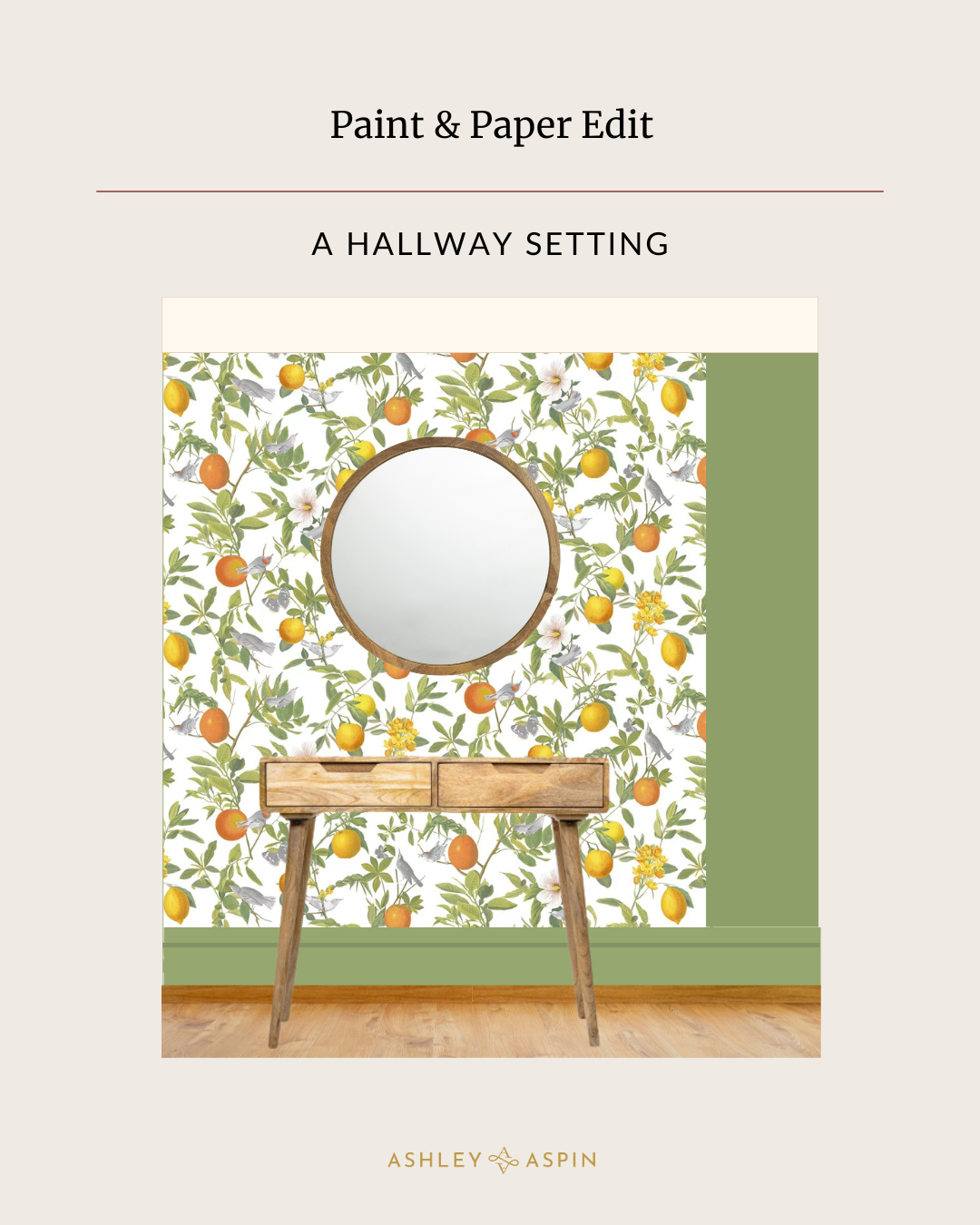
Even though I love the design, papering all the walls would be too much for me, so I’ve brought in Rock Samphire and creamy, bright Magnolia for the ceiling. I believe all colours have a time and a place to shine and just because Magnolia has been thrown on the proverbial heap by influencers doesn’t mean I will too. It’s great for a ceiling in a south facing hall. Clear, warm and sunny, even on cloudy days.


There’s a breezy elegance and a feeling of warmth that this paper captures in a way that resonates. And with that, I am metaphorically redecorating my hallway with it.
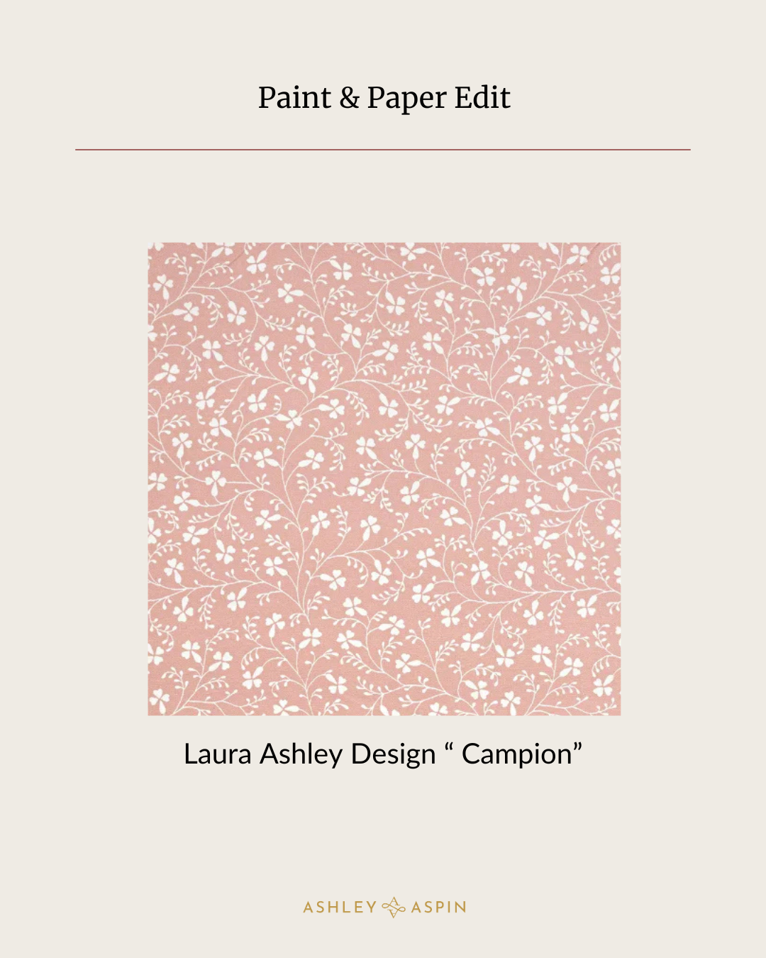
Now, for many years I had neither time nor inclination for wallpaper. My childhood bedroom was papered in a peachy Laura Ashley design called “Campion” and the curtains were in the same pattern with the colours reversed. It was immersive and in the eighties very much on trend. As we grow up and into our own style, it’s quite natural to eschew the choices your parents made for you regardless of whether you liked it or not (and that’s not limited to decoration). But the wave of nostalgia when I see Campion now takes me straight back to that room and in a good way. The pattern is still widely available to buy as a fabric.

Another strong paper memory is my grandparents bathroom which was decorated in an aqua blue and purple flower-power number (heaven knows why – it was a complete departure from the rest of their 300 year old cottage) the like of which I have never seen since. I sometimes trawl vintage sites in the hope I might find a sample of that retro wallpaper, just for the memory. I have lived with wall to wall woodchip in many rented accommodations and by the time I got to owning a home, wallpaper was the last consideration on my mind.
But now – it’s one of my favourite things in the world. Looking through collections, selecting samples, pasting and hanging, I love the physical feel of it and the aesthetic reward of a good paper. In the very first papering course I attended, the teacher gave each of us a paper to hang that was thin, ripped when I cut it and expanded too much if it was left for 10 seconds longer than the recommended soaking time. To add to the misery, it featured a perpetual pattern mismatch on the joins. In short, a soul-destroying task. All he said was “if you can work with this, you can work with anything.” I’m retrospectively thankful for the experience, tough as it was.
It’s safe to say having spent the last few years working with wallpaper, I am converted. Where I once saw it as fussy, I now see it as a design tool that can bring character and interest and escapism to a space. If you’re on the fence about it, trust me, I’ve been there, but find the right design and the right space and with the right balance of colour, you might just fall in love with it too.
Thank you again for sitting with me and see you again soon, Ashley x
Links


Leave A Comment