
Exploring Olo, the impossible Green-Blue Hue – plus – my thoughts on choosing sofas…
I’d say I learn something new everyday in the world of colour, but every so often, something turns up that really makes the jaw drop. In the news this week – a mysterious “new” colour, discovered by scientists at Berkeley, that it is claimed, no one’s ever seen before. Now that feels like a paradox. How can something be a colour if we can’t perceive it?
They’ve called it Olo — and apparently, it sits somewhere between green and blue but is brighter, punchier, and more saturated than anything in our existing visual library. Only a handful of people have been able to ‘see’ it through a highly controlled bit of retina-stimulating lab kit. Please note, this technology is not yet available at your local decorating centre.
A version of the colour has been created by artist Stuart Semple. If you don’t know his work, he’s a bit of a renegade in the pigment world. When sculptor Anish Kapoor secured the exclusive rights to Vantablack (a paint so dark it swallowed light and joy in equal measure), Semple responded with a black of his own, even deeper, even moodier, and available to everyone except Kapoor. A playful rebellion, perhaps, but also a firm stance: that colour should be shared, not locked away.
Semple has on the back of the discovery of Olo, launched YOLO, a paint based on how Olo was described by those lucky enough to glimpse it and he says he pulled an all-nighter to get the colour as close as possible to the description.
So what does this mean for decorating?
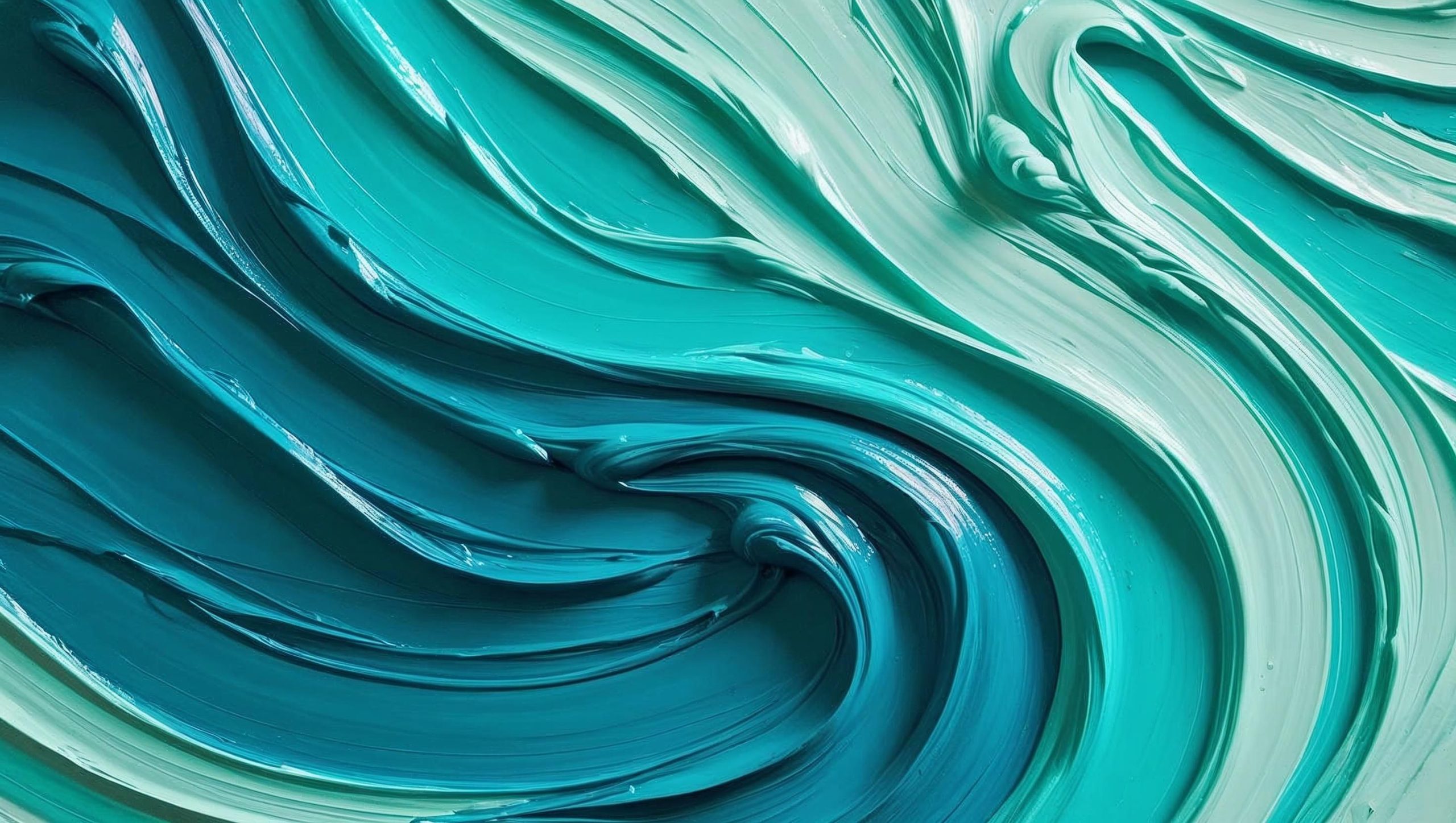
Unless you’ve got access to some laser-controlled, cone-isolating vision gear , you won’t be seeing Olo exactly as described. But it does invite us to explore something intriguing. Those saturated, hard-to-define hues that hover between our colour knowns. Ones that shift and shimmer, that feel different hour by hour, wall by wall. Now you see green. This evening, blue.
You might think combining blue and green would simply give you the best of both — the calm of one, the freshness of the other. But what you actually get is something else entirely.
What does Olo feel like?
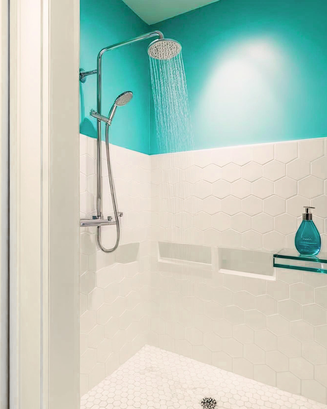
This is the bit that excites me most because mixing colours can have surprising outcomes. The effect that you might have hoped for from the balance of green and calm of blue is a world away from the vibrant, lively, energetic reality. It could work superbly in the shower room of an early riser. I wouldn’t recommend it for the bedroom of someone looking for a good night’s sleep. That’s the sort of sensation I’m always chasing in interiors — colour that does something, not just looks like something.
If you fancy bringing a bit of ‘Olo’ into your home
I’ve identified a few to consider.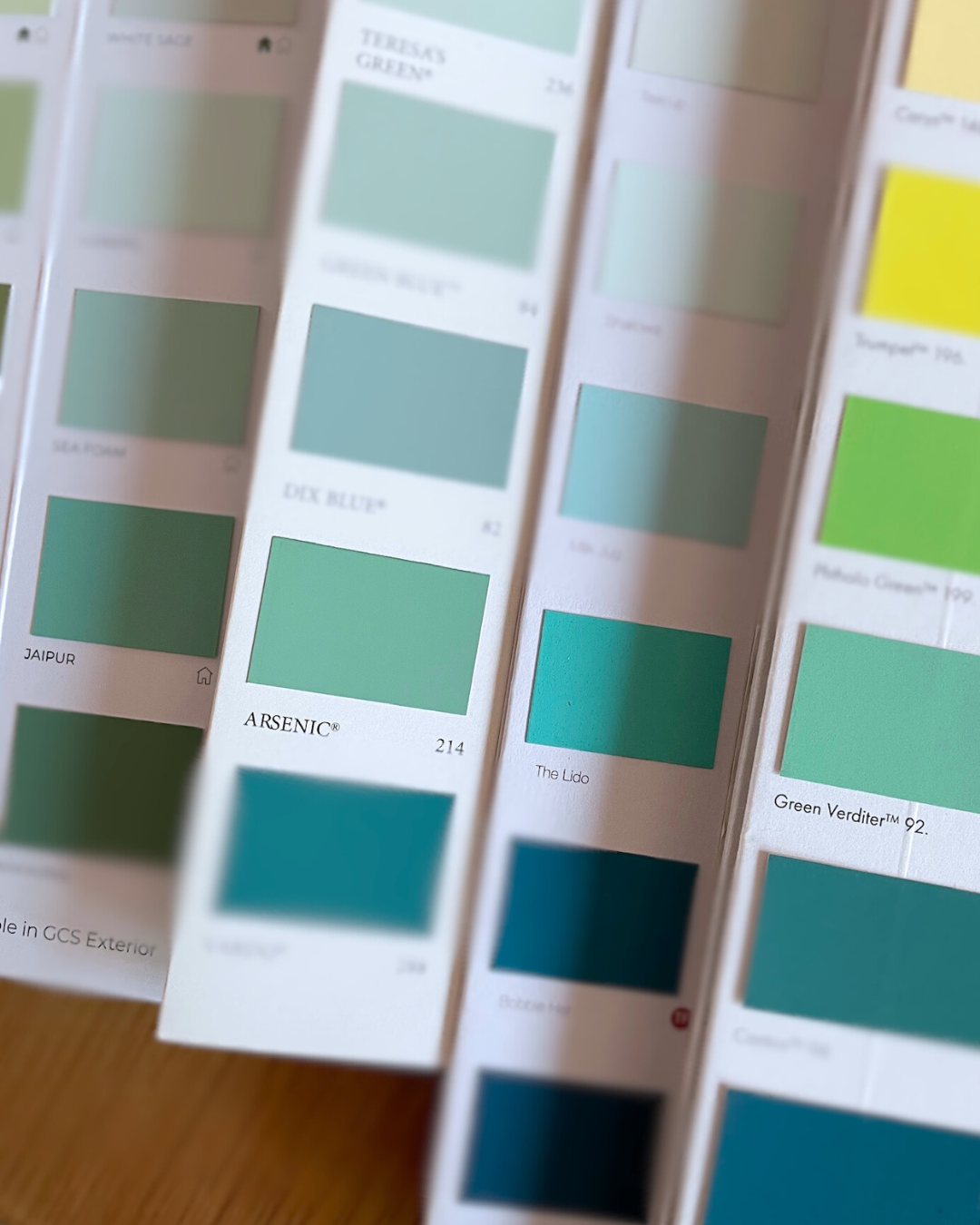
Farrow & Ball’s Arsenic – a classic, but feels grounded. Not too bright and saturated.
Little Greene’s Green Verditer – Bright and light, like copper carbonate.
Graphenstone Jaipur Slightly muted, but good saturation level.
Earthborn Lido –Saturated, bright and really eye-catching. No notes of subtlety.
Sanderson Tropical Palm – Darker, grounded, a colour you could dive into.
Edward Bulmer Turquoise – Pale, subtle and easy going.
Benjamin Moore Teal Blast – The greener side, full on and highly saturated.
I’d have to say that Earthborne’s Lido is the closest match of all the Heritage paints, but all serve as starting points. If you’re a fan of more muted colours generally, then keep this to a splash on woodwork or a pantry door where it can lift the spirits. The trick is to let it do the talking — keep the setting soft and natural around it, and let the boldness breathe.
I rather like that the actual colour Olo might remain out of reach for most of us, It reminds me that colour is an experience. A shifting phenomenon that still manages to surprise us.
Elsewhere this month…
It was a real pleasure being invited by Rent. the lifestyle blog run by US and Canadian company Redfin to share some thoughts for their latest feature on statement sofas… . The piece explores the rise of statement sofas — how they’ve become today’s gallery walls: bold, expressive, and central to how a room feels.
Now, sofas aren’t usually my primary focus — but after years of helping people shape their homes, I’ve seen what works and what jars when it comes to the big, anchoring pieces. I shared a few thoughts on choosing a sofa with presence and a sense of belonging.
If you’re in the mood for a quick read (or daydreaming about future furniture), you can find it here:
Statement Sofas Are the New Gallery Walls — Here’s How to Pick the Perfect One
Until next time, Happy Decorating!
Ashley
I’m an interior painter & decorator and colour consultant. I help home and business owners take the guesswork out of decorating and create spaces that feel just right. This is More Than Four Walls where I share the deeper side of decorating—colour choices, creative process, and the quiet power of home. Join me on Instagram or subscribe to the Substack newsletter for thoughtful updates, real project insights, and seasonal inspiration. Or, if you’d like to book a personal appointment click here.

Leave A Comment