
Once upon a time there was a decorator who decided she’d like some accessories for herself in the way of additional ear piercings and a small tattoo. And so it was that she entered the premises at number 15, Bramhall Lane, Stockport. Otherwise known as Bee Tattooed…
And that’s how this began, a simple appointment that turned into the beginnings of a new working relationship. Somewhere between the needles and the aftercare advice, a long conversation unfolded about design, colour, and how a space can feel. A fortnight later, I was invited back, colour deck in one hand, tape measure in the other.
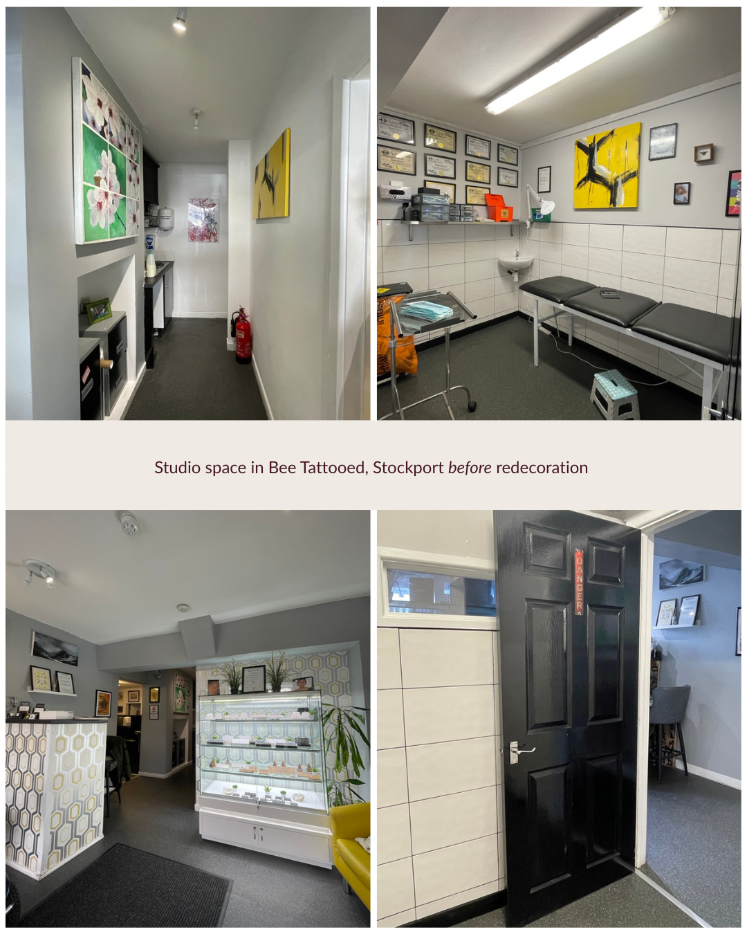
Bee Tattooed has a fiercely loyal following and a reputation for high standards, (I can vouch for that – the place is spotless, reviews exceptional), and it is built on dedication and old-fashioned graft. When they got the keys, the priority was to open quickly, so owners Matt and Liam, hastily freshened up walls with some pale grey paint adding black gloss to the woodwork and stuck with the standard issue brilliant white ceiling.
The decor looked jaded and true to form, grey was zapping the life out of it’s surroundings. Even the vivid yellow and black artworks (a nod to the worker bee which symbolises Manchester’s industrious history) felt disconnected. Of all the colour combinations in a setting involving needles, black and yellow buzzed in all the wrong ways. It’s nature’s warning after all – hang around here and you might get stung.
In a business where some discomfort is expected, using colours the brain reads as danger signs is like shrieking violins on a film soundtrack. What the space was lacking was warmth, colour and a gentle energy — something grounded, professional, and unmistakably them. I got to know the business and the people, I listened, asked a squillion questions, and observed the rhythm of the place building the picture from the ground up. And from all that, the design began to reveal itself.
The Process
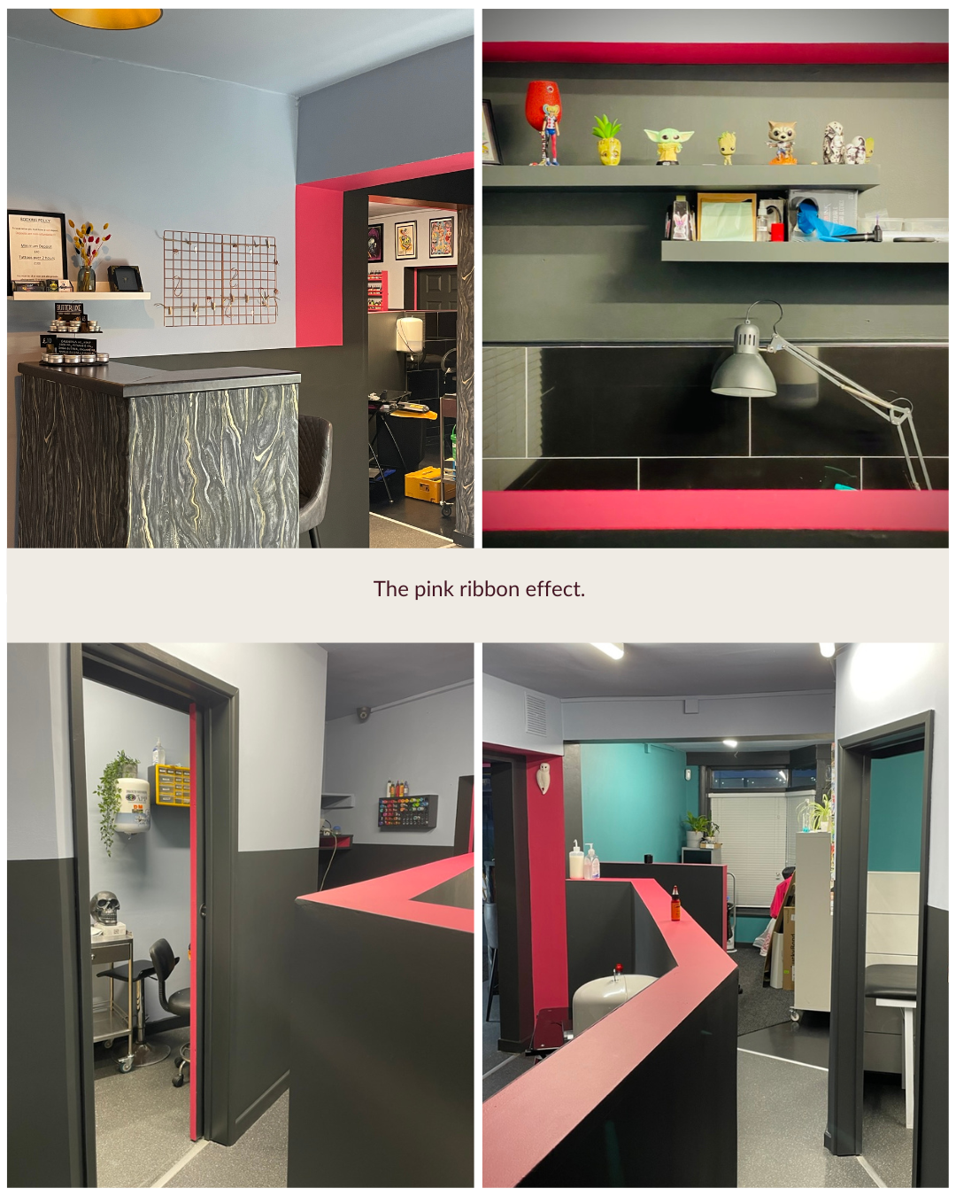
Phase one began with a new palette. We eliminated grey and brought in a calming daydreamy pale blue. (Little Greene “Pale China Blue”) If you’re lying on a couch for a while you’ll experience stinging and scratching, and this colour, reminiscent of a summer sky is so soothing. I painted the majority of walls and ceilings in this colour, all the way through the studio. Some tattoo customers report zoning out, going into a trance like state. This is the perfect colour to support that too.
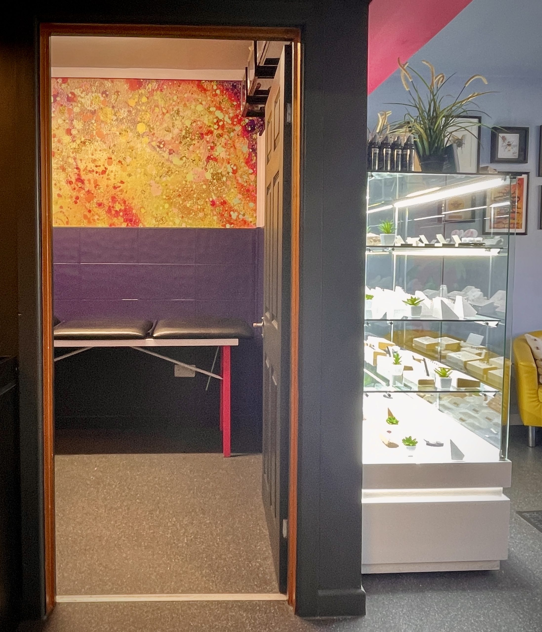
Then I introduced some drama with two colours. “Lamp Black”, a deep charcoal for the bases of the walls and skirting boards, and “Leather” a saturated rich, vivid pink which linked the open-plan zones playfully around door frames and the tops of half walls and in the odd return. It runs through like a ribbon with a purposeful energy. Enough to lift the space and make customers smile, but not so much that the team tire of it. Placement was key. Every inch considered to support the flow and feel of the studio.
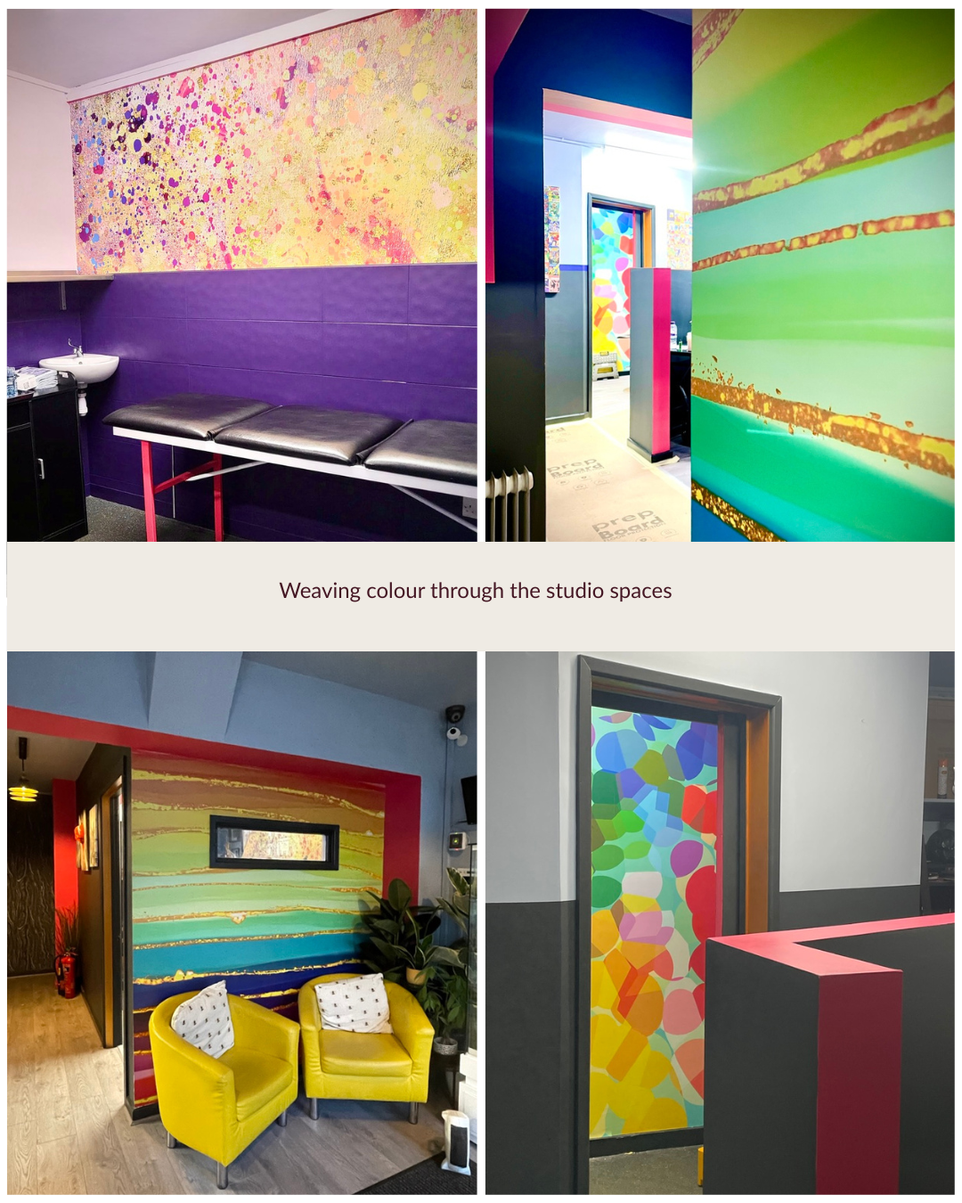
In phase two, once the core palette was in place, we layered in more colour. Bolder abstract wall murals were installed in the piercing rooms. Artwork was properly supported by background tones. Several walls got the horizontal split treatment — some to sit in sympathy with the half-level walls around them, others simply to add a little interest here and there. The whole scheme began to settle into itself: bright, characterful, and entirely theirs.
And then the details began to find their way. Door edges, window frames, a personalised stencil, and the addition of the deepest blue-toned purple in selected areas. Purple is the colour of piercers. It carries an otherworldliness — a nod to introspection.
The door and wall to the main studio is charcoal black, so that stepping into Matt’s space is like entering a mini theatre of light. Other doorways have golden ochre detailing which catches the light, echoing the vast collection of shiny jewels.
The Result
The studio hums with character, colour and confidence and customers notice, even if they can’t always put their finger on why. There’s a sense of ease and warmth and you’d be hard pressed to find another tattoo and piercing studio like it. Not because it’s louder or bolder than others, but because it’s truly theirs. The colours are drawn from the personalities who work here, from the rhythm of the day, from the way they welcome every client through the door. It’s utterly authentic. It feels to me like the moment colour television arrived after all the years of monochrome.
And the best part? I still pop back every month or so for a spot of window dressing. It means I get to keep an eye on things and catch up with Matt and Liam over a brew.
It is without a doubt one of my most favourite transformations not just for the colours, but for the conversations. Every day, there were stories of love, loss and life, some heartbreaking, occasionally hair-raising and often wonderfully outrageous. Bee Tattooed is a space where people are seen, heard and held, and to have played a part in shaping it to reflect the care, talent and strength of the team who reside there and of course, their customers, is a privilege.
If you too are thinking about a new tattoo or piercing, you can find out more and book via the Bee Tattooed website here
This is the kind of project I love : where colour isn’t just decoration but a form of storytelling. If you’re new to More Than Four Walls, you might enjoy this blog post on colour in our home affects us, often in ways we don’t expect.
Until next time, happy decorating!
Ashley
I’m an interior painter & decorator and colour consultant. I help home and business owners take the guesswork out of decorating and create spaces that feel just right. This is More Than Four Walls where I share the deeper side of decorating—colour choices, creative process, and the quiet power of home. Join me on Instagram or subscribe to the Substack newsletter and if you’d like to book a personal appointment click here.

Leave A Comment