 Hallways do more than we give them credit for. After a long day, they can make or break how it feels to walk through the door.
Muddy boots, trainers, dog leads, school bags, parcels either waiting to be opened, or sent back… they carry the traces of everyday life. But here’s the thing: they are the last to wave you goodbye, and the first to greet you on your return. Before you’ve had a chance to exhale, this space is already speaking to you. So what it says, matters.
When my client felt her hallway wasn’t right. “It just feels gloomy,” she said. “Like the house is apologising before it’s even said hello.”
She’d tested some colours in the hopes of creating something warm and cocooning—but it had the opposite effect. The dark tones she’d chosen felt flat in the morning light and oppressive by evening. It swallowed the space. And whilst I could appreciate her being drawn to the idea of warmth, it needed translating—into something lighter, and more open.
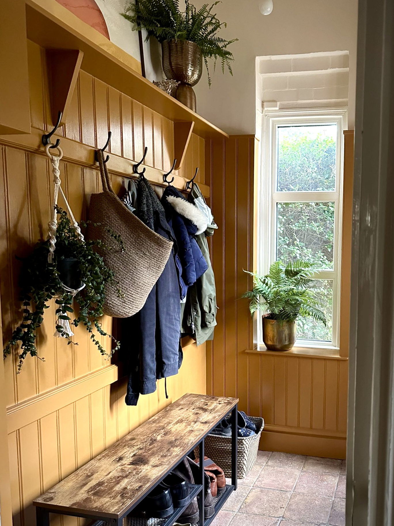
The entrance is south-east to south-facing, which means it gets a strong sweep of light through the day—clear and angled in the morning, golden and low by late afternoon. The terracotta tiles on the floor were staying, so the palette needed to work with that natural warmth without clashing or dulling it.
We started with a colour consultation. I asked lots of questions: How do you use this space? (I know that sounds obvious—it’s a hallway, we enter and exit—but are coats and bags staying here, or being stowed elsewhere? Is it a pause point, or a thoroughfare?) We spoke about function as much as feeling, because colour has to work practically too—especially in a space this busy.

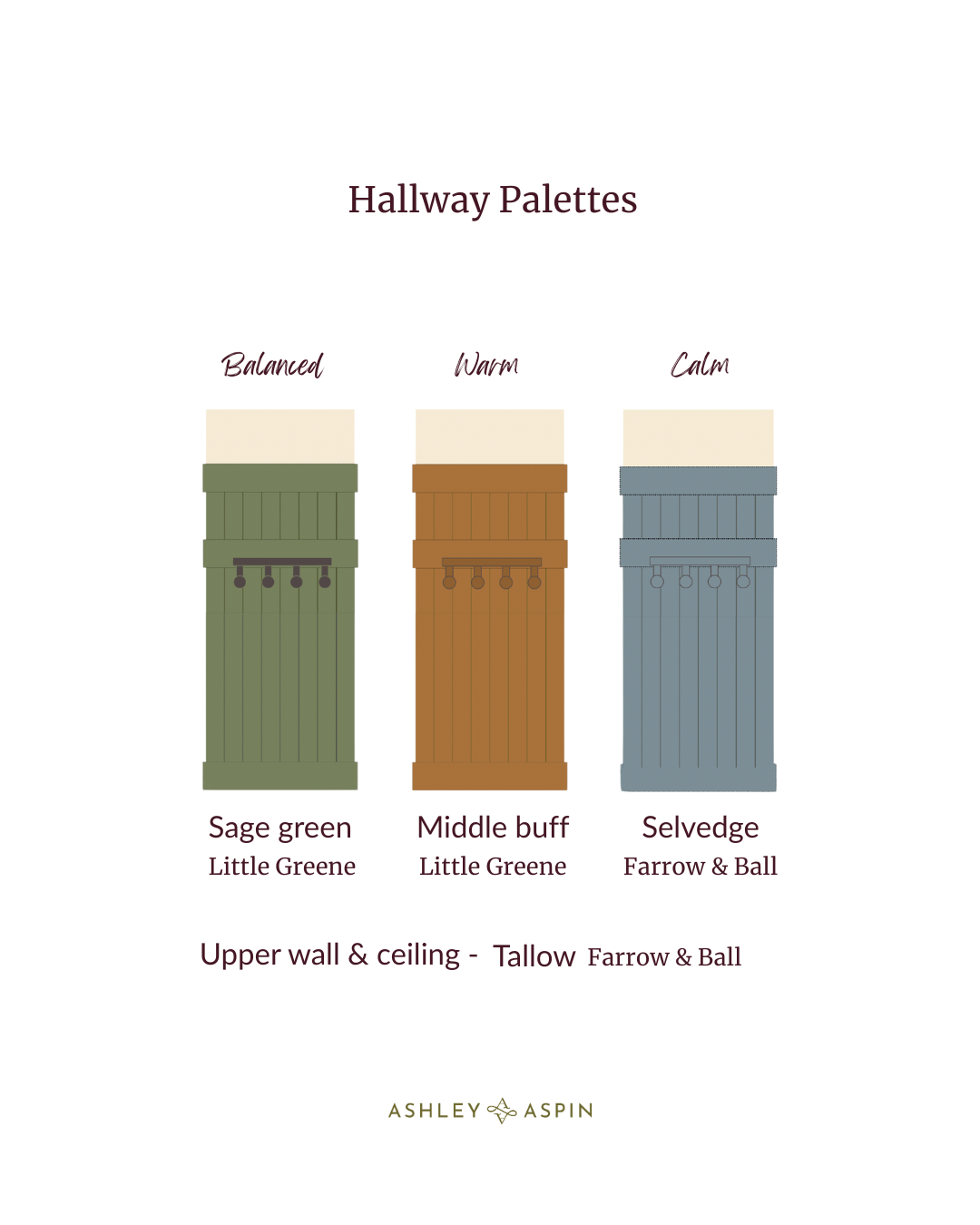
We considered a few different directions—a green for its ability to connect strongly with the outside and a blue for a calming effect, but this warm ochre by Little Greene Middle Buff simply sang. It had the softness, the life, and the gentle complexity that the space seemed to ask for.
The colour has a full range. It can appear yellow, brown, or orange depending on the light, bringing a very natural, restorative warmth. For the ceiling, I chose Tallow by Farrow & Ball. It’s a soft, creamy white which allows the ochre to be itself without competition and creates a light, airy ceiling space. The terracotta flooring now feels grounded and celebrated rather than fought against.
It’s still a space that works hard but now it works with purpose and joy. Most importantly, this entrance now sets the tone for the rest of the house. No apologies here, it says: “Welcome back. You’re home.”
Thank you for joining me here. I hope it’s left you inspired to see your own home with fresh eyes. Until next time—happy decorating.
Ashley
You can read more blog posts about interior decorating on More Than Four Walls


Leave A Comment