
Colour, Nature and the Feeling of Home.
Continuing from where we left off on tonal colour harmony – I want to show you a way to choose a colour from nature and placement in a space. But first I want to share something that caught my eye yesterday because it fits so neatly into this subject.
I saw a post online about biophilic design. Biophilic design is everywhere—or at least, the phrase is. You can spot an article on it a mile off—just look for the green-painted walls and pot plants. But let’s be honest: slapping a few leafy specimens in a verdant space and calling it biophilic is akin to microwaving a ready meal and saying it’s home-cooked.
True biophilic design isn’t about a colour trend or a token houseplant; it’s about creating spaces that feel connected to nature and that can start with any colour found in the natural world—the key is understanding how to harmonise tones as nature does so effortlessly.
The real reason biophilic design feels good? Because we are part of nature. Yet so many of us (I generalise, but the point stands) are disconnected from it. No wonder greenery is used as a go-to visual shortcut—our digitally saturated brains need the reminder.
Good biophilic design keeps our deep connection with nature—shifting light, air flow, natural materials that age gently, and is as much about the way a space feels as how it looks. Biophilic colour schemes (created with harmonious colours) feel balanced. There is a sense of ease and cohesion. They feel inviting, because harmonious colours support each other and don’t fight for attention so the whole environment is relaxed as a result.
Now with all this in mind –and bringing back the tranquil colours of that Welsh sunset – let’s tap into nature right now and use her colour power to create a scheme of our own.
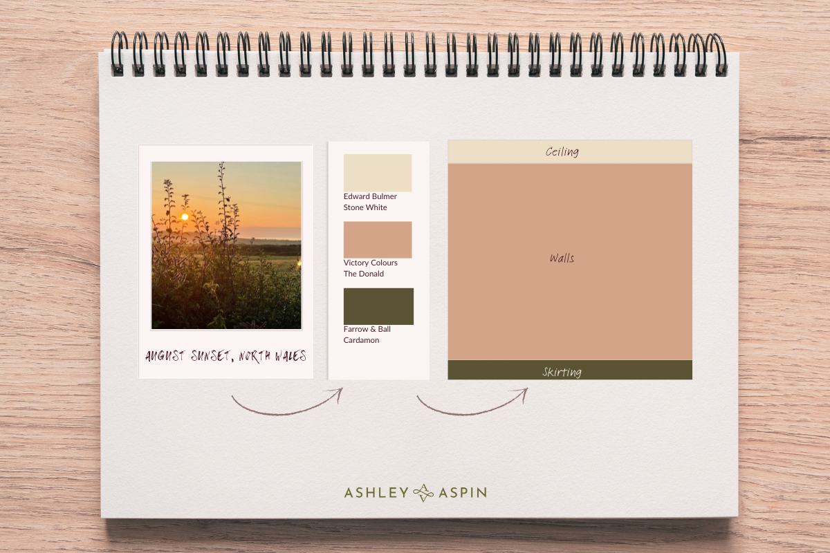
All I have done here, is take colours directly from the photograph, pale, mid and a darker colour to create a theoretical scheme for a bedroom. I’ve matched real-life paint colours so you can see this more tangibly. It’s all very well having the colours in front of you, but the proportions are every bit as important, and to take this one step further – here is a mock up of how it could look with some furniture in place.
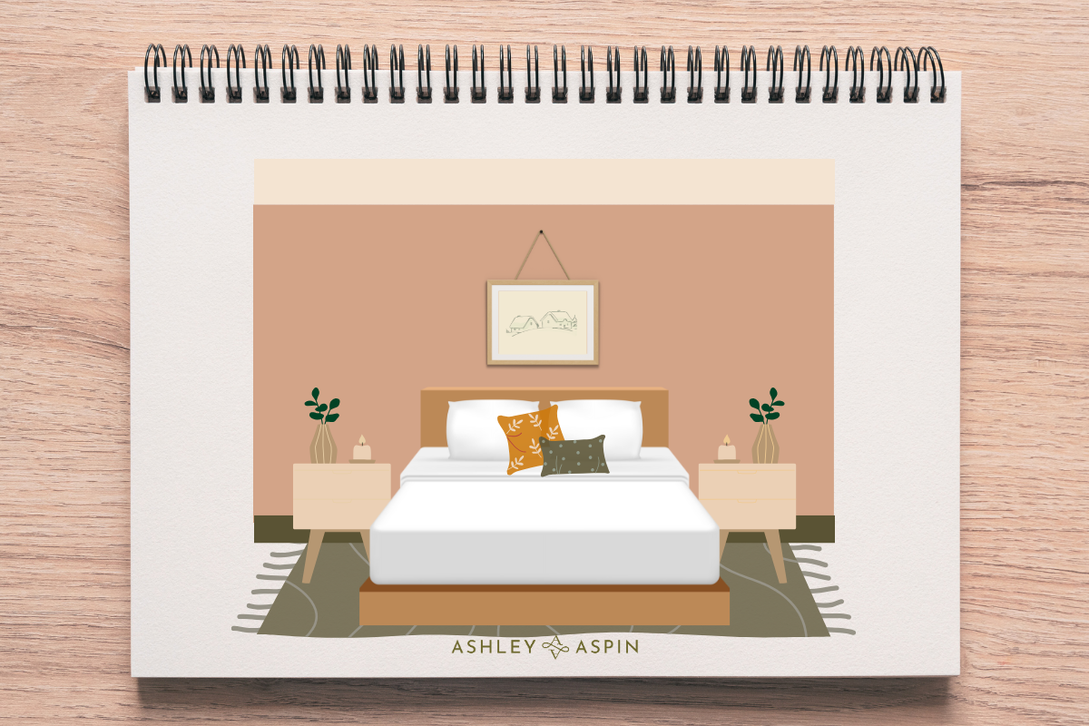
Notice how, once the furniture is in place, the dark skirting board becomes almost invisible, yet the subtle hints of it truly anchor the space. The terracotta colour is a soothing backdrop for bedroom walls – warm and comforting. The ceiling is pale, a familiar choice for most, keeping things simple for now. Naturally, not everyone may resonate with these colours, but my aim is to showcase how you can capture a moment and apply the principles of nature to your own surroundings.
I used Canva here because I wanted to go further with a mock up of an imagined space. But you could use Palette Cam a free, easy to use app into which you to upload a photo. You then use a cursor to pick out colours and the app will save your photos and colours including hex codes for the colours you have selected.
By drawing inspiration from nature, we can create spaces that are both beautiful and calming. The colours from the Welsh sunset remind us of nature’s harmony, helping us bring that moment of tranquility into our homes. And should you come across biophillic design in the media – know that it is so much more than a trend; it’s a meaningful way to enrich your environment and enhance your well-being.
Thank you for joining me today and taking the time to read, I hope this leaves you inspired to see biophilic design in a new light.
Ashley
PS If you’d like to see more of my work you can click here to flip over to instagram or you can now find more posts including previous blogs on Substack.

Leave A Comment