ON HOW COLOUR IN THE WILD IS GOOD FOR YOUR HOME
When it comes to putting colours together, nature is the ultimate master of her craft. After all, no-one ever paused to admire a sunset and thought hang on, those colours clash terribly. Think of fiery, golden leaves on an autumn day or the cool misty blues and greens of a morning by the coast – nature’s own colour combinations are beautiful, effortless and harmonious. Nothing needs adding or taking away.
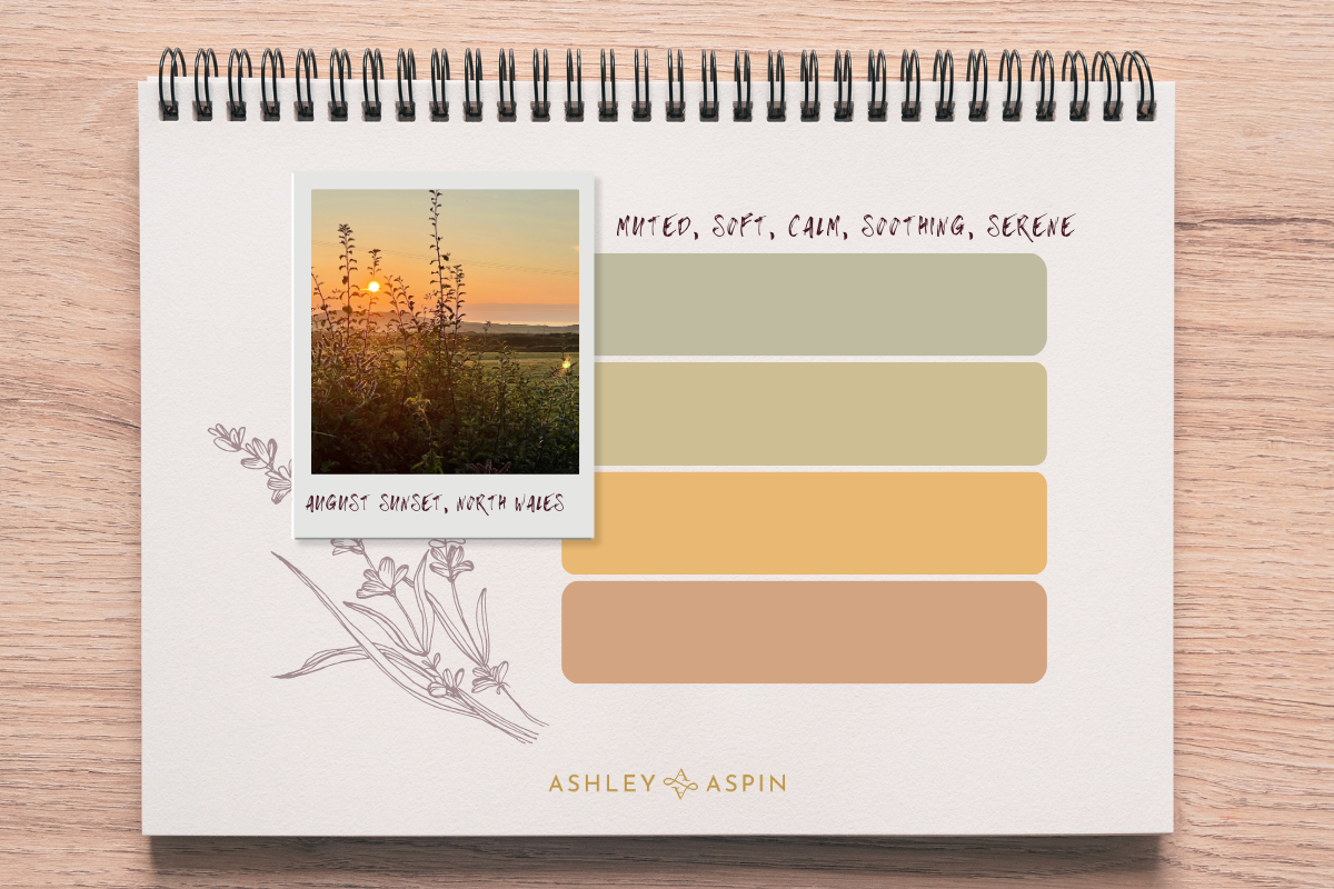
The reason we find those sunsets and autumnal walks a pleasurable experience is because the colours in each setting harmonise with each other, they share similar qualities so nothing looks out of place. Take this sunset for example. I’ve selected four colours from the photograph so you can see how they look together on paper.

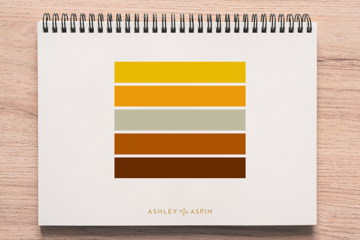
Here is a similar treatment of an autumn scene. The colours feel different to the sunset colours, they are warmer, and stronger, but they work with each other.

Put simply, the colours harmonise. Imagine if these colours were musical notes. Played together, they’d produce a sound that was pleasing to the ear (just as the colours are to the eye). You would absolutely call it harmonious. It almost hums. It feels good. (Sometimes I even experience a taste sensation like a delicious flavour combination – and I know then for sure that the colours are right for each other).
In the home or workplace, decorative colour schemes that are created using colours which harmonise feel balanced, there is a sense of ease and cohesion. It’s inviting, because harmonious colours support each other and don’t fight for attention so the whole environment feels relaxed as a result.
To continue the musical analogy; if we included a note that doesn’t “belong”, it creates discord. You’d probably notice it feels uneasy, unresolved. If I place a colour from the sunset picture into the autumn colours you can see the wrong note in action.

Likewise if your current colour scheme feels not quite right, but you can’t work out why, the chances are that this is what the problem is. You may have colours from more than one group next to each other creating that feeling of uneasiness. Or, you may be in the presence of a group of colours that do actually work together, but you just don’t feel an affinity with the group as a whole.
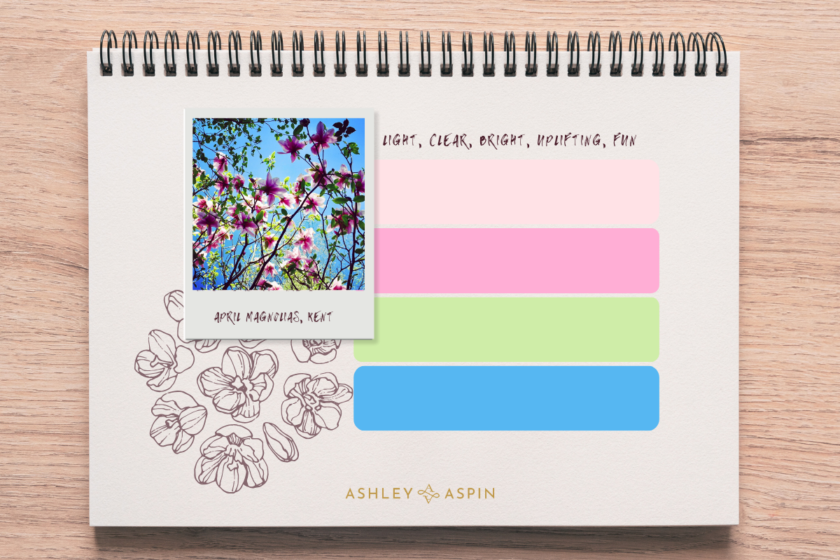
Looking again at the sunset colours and the autumn ones – do you feel drawn to one group more than another? If not – here are two more groups of colours and as you might have already guessed by now, each group has qualities which align with the archetypal seasons (Spring, Summer, Autumn and Winter) so it’s easy to think of and remember them in this way. Here we have Spring:

…and Winter:

You may find yourself drawn more strongly to one group of the four. (This doesn’t mean that if you like the colours of spring that spring is necessarily your favourite season. It’s the characteristics of the colours that you will be experiencing, often subconsciously.)
Every colour in nature can be categorised into one of these four archetypal groups. Spring colours (with white tints) are bright clear and fun, like a sunny April day. Summer colours (with grey tones) are muted and soft, like a hazy hot summer afternoon. Autumnal colours (shades containing black) are warm, earthy and wholesome as you would associate with the season. Winter colours feel either icy cold or bold and strong. (These are hues without any white or black added). When you select colours from the same group, they will always work together.
The name for grouping colours like this is Tonal Colour Harmony which was discovered and developed by colour psychologist Angela Wright who sadly, passed away just last year. Her theory was the result of her research into the colour spectrum’s relationships with human behaviour and her work was made available to the wider world by one of her students, Karen Haller, author of “The Little Book of Colour”. I am incredibly proud to say that Karen is my teacher and mentor, and I credit her with transforming my thinking about how we use colour in the home, thanks to her and Angela’s work.
I’ve always felt that decorating schemes can be hit and miss using conventional methods of selecting colours such as the colour wheel. It feels instinctively much more beneficial for us as humans, (and it is easy to forget that we are in fact, nature!) to tap into and harness the powerful use of colour that nature demonstrates.
In the next post I’ll show you how to use all this to create a harmonious colour scheme that’s right for you in your home.
Thanks again for your company and see you next time.
Ashley
PS Next time you’re watching the sun set or another lovely moment in nature – let the colour do the talking. It literally never disappoints.
To see more of my work on instagram please click here. Or click here if you’d like to get in touch about decorative colour consulting for your home or business.


Leave A Comment