
There’s a moment in almost every colour consultation when a client shows me a swatch and says something like, “It a warming taupe with cool undertones,” and I gently break it to them that despite the description, what they’re holding is beige. Or maybe grey. Or both. But not what the blurb suggests.
Choosing paint can feel like an overwhelming puzzle. It’s easy to get tangled up in the flowery descriptions and endless colour options. Paint companies are really good at making their colours sound like the solution to your decorating difficulties. But often what’s promised on the label doesn’t quite match what happens once you roll it onto your walls. You get excited about trying “the perfect warm neutral, for effortless elegance”. Great, you think. This will make my space cosy AND beautiful. The next day, you’re staring at a patch of wall that feels very much at odds with, and not at all what you hoped for.
Why is this? Surely if the description fits – it will work? I’ve often thought that paint descriptions could be compared to online dating profiles. “Easy-going with warm undertones” might sound great, but you won’t really know until you meet them in person. And even then, they might behave very differently when your family come to visit.
That word, undertones, causes more confusion than I can throw a brush at. It gets mentioned a lot, especially with pale colours – beiges, whites and creams – as though the undertone is the defining quality of a colour. But unless you understand what an undertone is – how useful is this?
The answer lies in pigments. Every paint colour is a recipe. And like any good recipe, it’s the ingredients, and their proportions, that make the difference. That’s why, if you take a Farrow & Ball shade and get it colour-matched at a trade store, you might get something that looks close—but once on the wall, under your lighting, in your home, it behaves differently. Sometimes very differently.
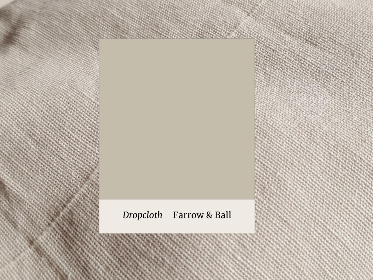
Before I met her, a client of mine last year had chosen Farrow & Ball’s “Drop Cloth” for her hallway. This is a balanced not-quite-grey, not-quite-beige (named after the classic decorator’s protective covers) and on the advice of a friend, she bought a colour match with a cheaper brand to save a bit of money. She told me, “It feels cold, like the colour’s dead.” The match was technically close, but the warmth and softness she’d seen in the original had vanished.
Manufacturers such as the likes of Farrow & Ball, Little Greene, Victory Colours and Edward Bulmer (not an exhaustive list), often use many pigments in a single colour—sometimes up to a dozen. The layering creates subtle shifts, richness, and a kind of quiet movement. One wall might feel warm and lively in the morning, then cooler and calmer by evening. It’s the pigment and the light interacting and it is genuinely magical.
Cheaper brands usually use fewer pigments and more synthetic fillers. Nothing ostensibly wrong with that, but if you want atmosphere—if you want a colour to feel alive—that’s where quality pigment mixing really matters.
For my client, that complexity was missing. And that’s because the pigment mix in the colour match was achieved with a different mix using fewer colours. It was a close copy, but not the same – a bit like seeing a print of an original artwork.
When you hear or see the word undertone, think pigments and you are already on a better path for understanding the colour. There’s so much more to talk about on this, but here’s some practical tips for now.
Test, always.
Paint two coats on a good-sized piece of lining paper, taking the colour right to the edges. Stick it on the walls (on its own – not with three others fighting for your attention and live with it). Look at it in the morning, in the afternoon, under artificial light. You want to know what it’s doing, how it is behaving at 3pm on a rainy Tuesday.
If you’re going for a colour match, test that version too. It sounds obvious, but I’ve seen so many people fall in love with the original, order a match without testing and end up disappointed.
Ignore the label, at least at first.
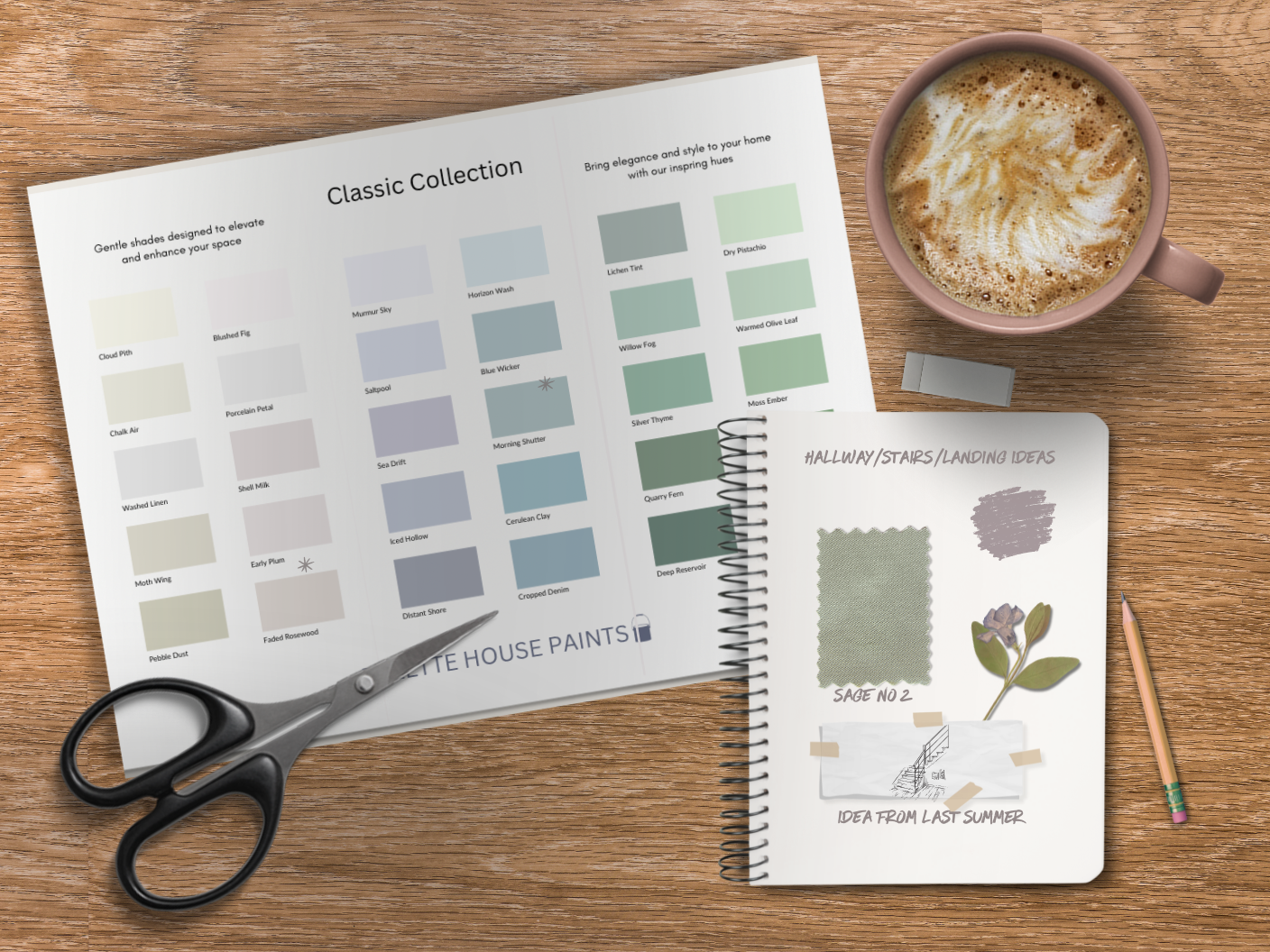
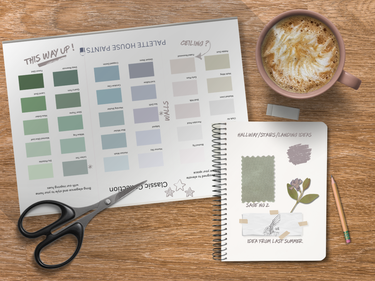
Descriptions will always sound nice. But they rarely help you see the colour. Even the paint colour names themselves can be a distraction on a colour chart. One of my favourite tricks? Turn your colour chart upside down. You’ll start really seeing the colours. It’s unbelievably effective.
Ask someone who isn’t just reading the tin.
A good colour consultant isn’t swayed by poetic descriptions—we’re looking at how a colour lives in your space, with your light, next to your things. Because choosing colour is part science, part psychology and a little detective work.
At the end of the day, a colour that makes you feel good in your home is always the right one, whatever the description. Just make sure you’re falling for how it feels, not just what it says it will do. Make it a colour date and find out whether that paint is all talk before committing.
Until next time, happy decorating!

Leave A Comment